
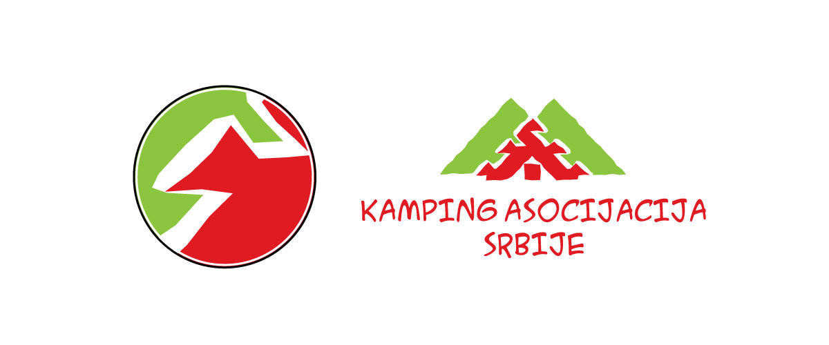
Company: Camping Association of Serbia (KAS)
Project: Rebranding
Expertise: Branding, Logo Design, Icon Design, Typography, Illustration, Research
Project: Rebranding
Expertise: Branding, Logo Design, Icon Design, Typography, Illustration, Research
Background
KAS is a non-profit organization dedicated to the development of camping in Serbia. It aims to create opportunities for new camps, revitalize existing ones, and foster the growth of local communities through self-government and entrepreneurship.
Challenge
It's a privilege when a client approaches you to modernize a logo you've created 20 years ago. The logo's 'shelf life' exceeded my expectations.
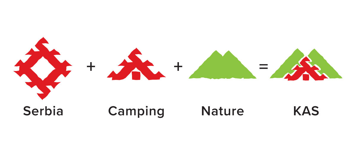
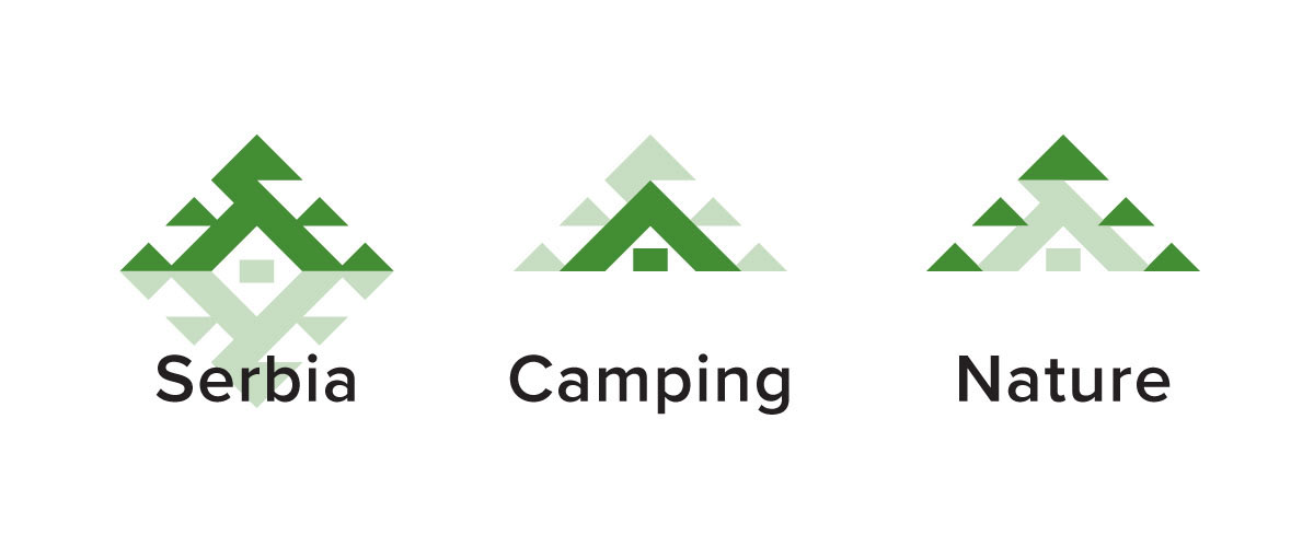
The original idea combined the popular Serbian folk-style carpet pattern, an ancient Slavic symbol of the sun, with camping and nature symbols.
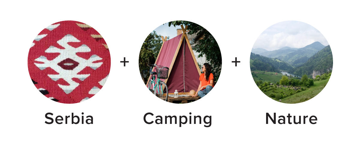
The carpet pattern, transformed into a tent, retained its appeal.
However, the freehand stroke aesthetics, once trendy in tourism and location branding, had become outdated along with the typography.
The challenge was to find an authentic aesthetic that would surpass trends yet maintain the original idea.
Additionally, the logo had to work when scaled down on social media, now a priority brand touchpoint.

Action
This led to a simple task list:
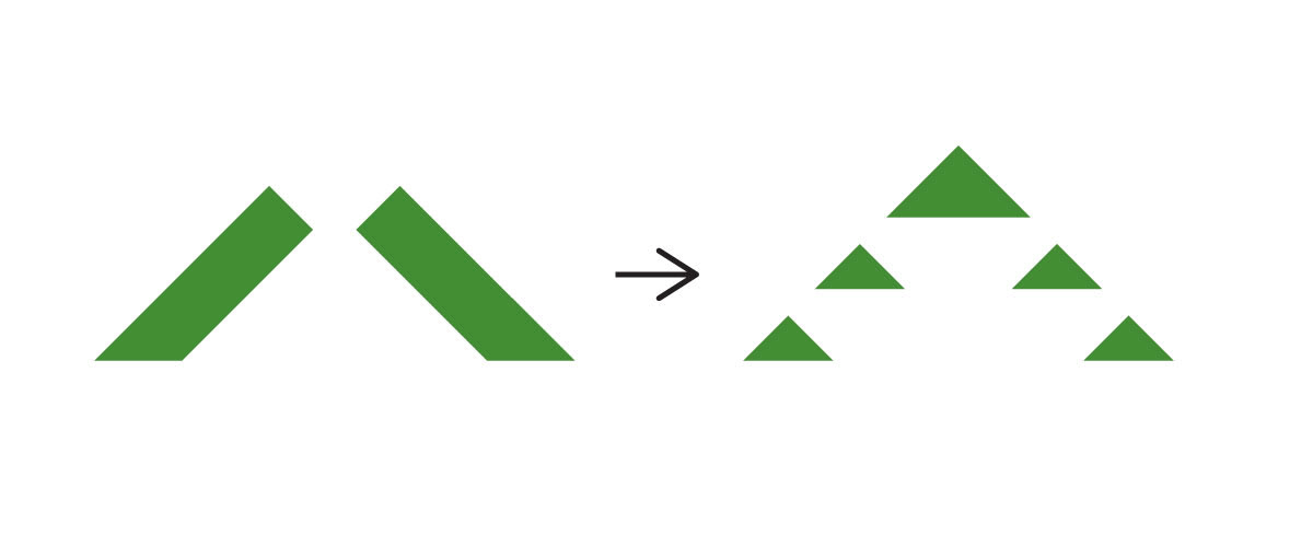
1. 'Geometrize' aesthetic to surpass trends.
2. Simplify the graphic for better scaling.
3. Update the colors and type to better represent camping.
2. Simplify the graphic for better scaling.
3. Update the colors and type to better represent camping.
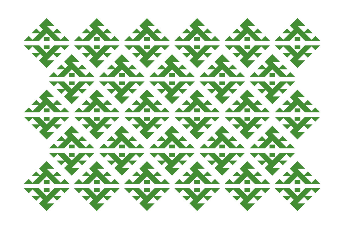
The first attempt separated the tent from the background mountains, giving an unintended volcano impression.
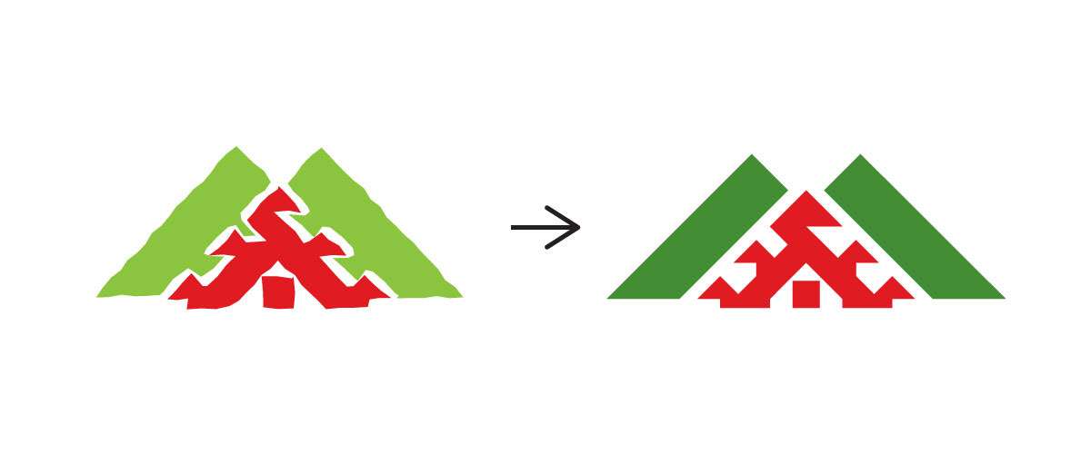
I tweaked the nature element, transforming green mountains into triangular pine trees.
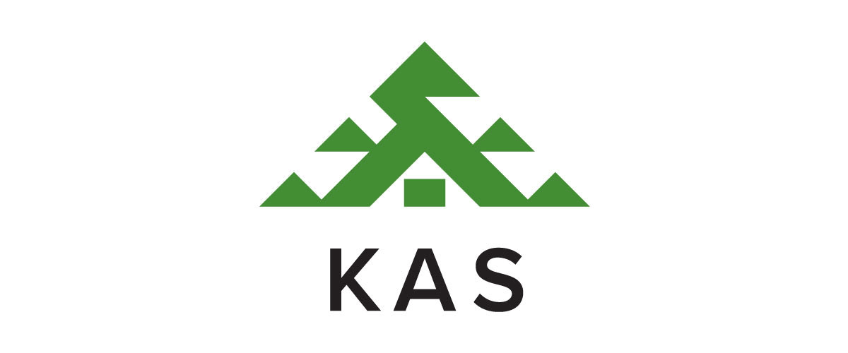
To reinforce the relationship between camping and nature, I overlapped the tent with the pine trees and reduced the color palette to a single green.

This was done within a firm geometric grid.
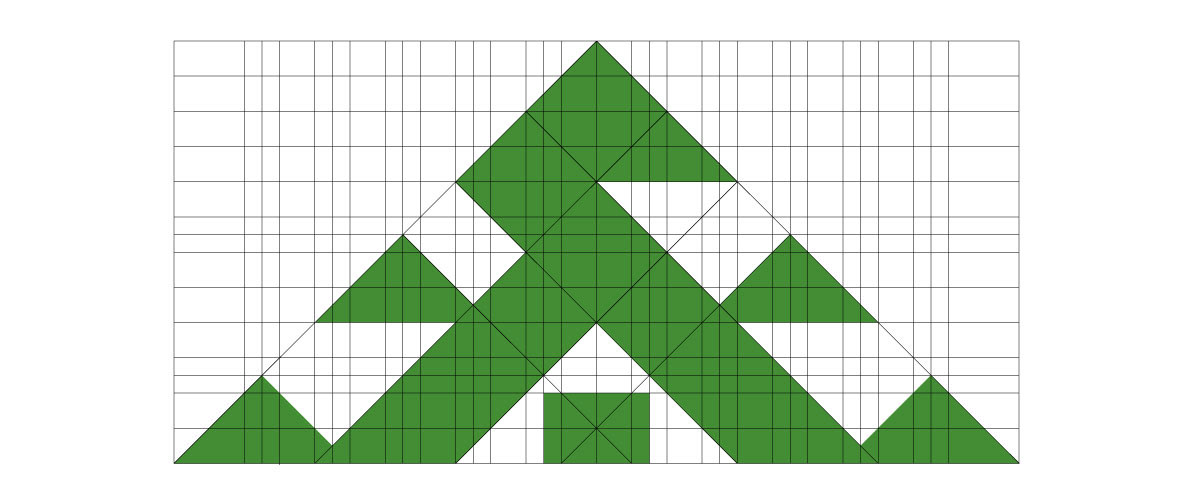
It simplified the graphic while retaining all essential elements: the carpet pattern, tent, and nature.
Finally, I replaced the original handwritten font with Proxima Nova and recommended using the abbreviation: KAS.
A big thanks to Vladimir Djumic, the president of the Camping Association of Serbia.