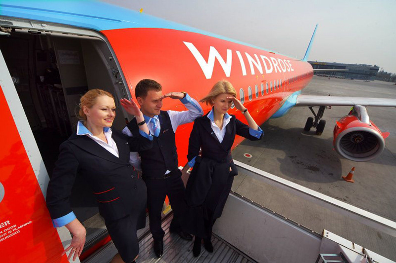
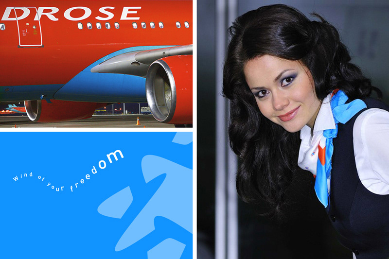
Company: Windrose Airlines
Project: Windrose Visual Identity
Expertise: Branding, Identity design
Project: Windrose Visual Identity
Expertise: Branding, Identity design
Background
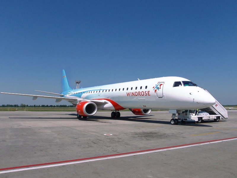
Windrose Airlines is a Ukrainian charter airline. Founded 2003, the airline operates charter flights to destinations in Europe, Turkey, and Egypt.
Challenge
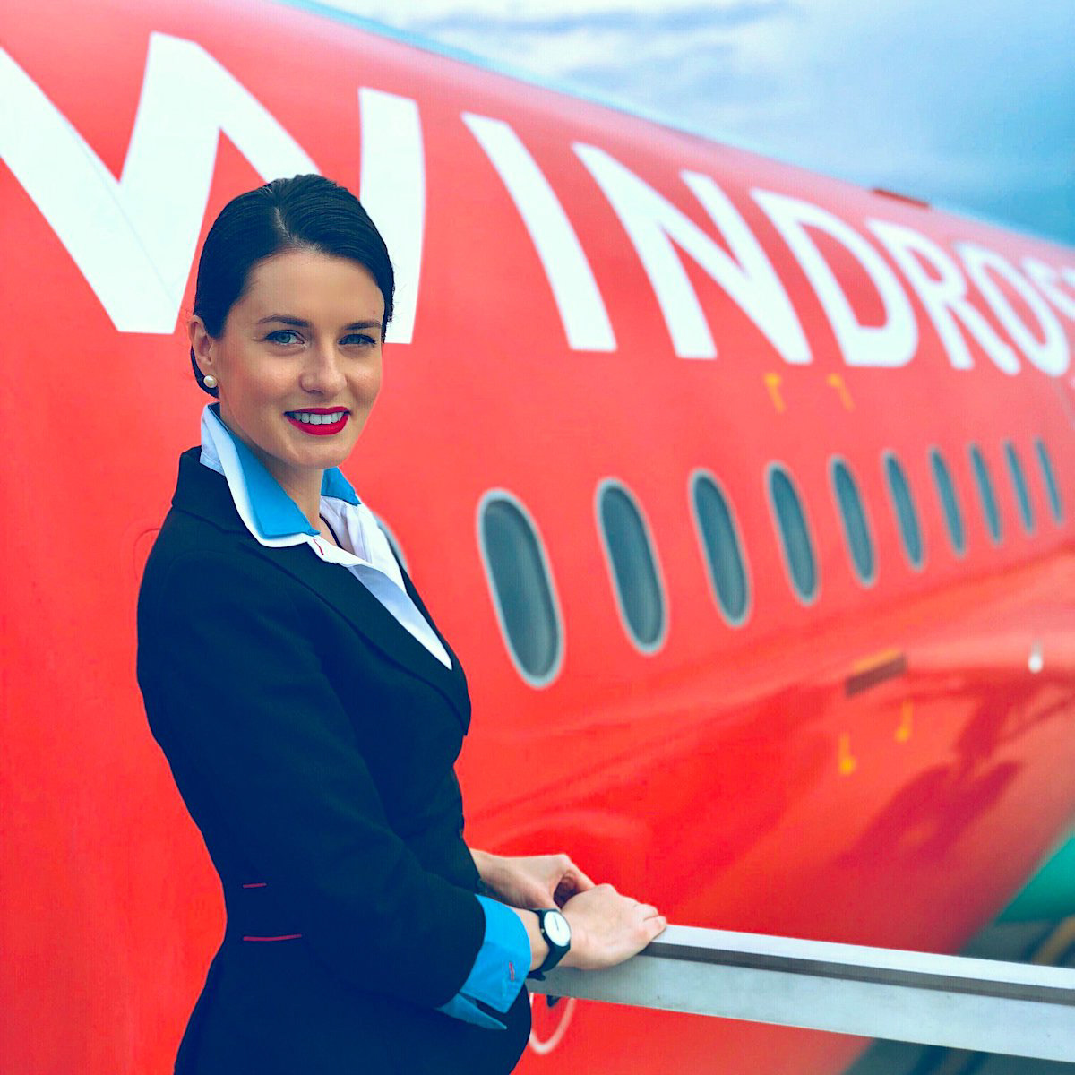
In its first year of operations, Windrose Aviation became a recognized brand that has made a name for itself. However, its visual identity was a bit behind the overall brand experience. Especially the old logomark lacked the appeal of a modern, safe and aspiring aviation company.
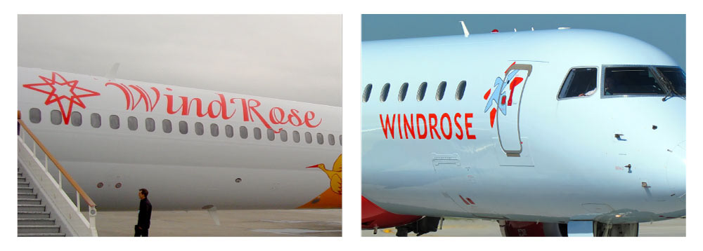
Before / After
Action
After conducting competitive analysis, it became clear to us that Windrose needed a strong symbol in order to stick out in a small yet saturated market.
We based our concept on the company’s catchy name. However, we didn’t want fall in the trap of just copying the wind rose symbol from maps. There was an opportunity to come up with something unique.
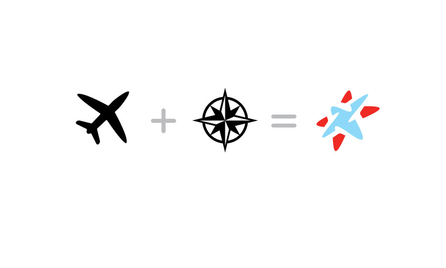
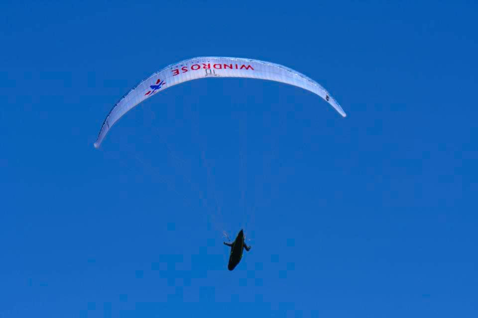
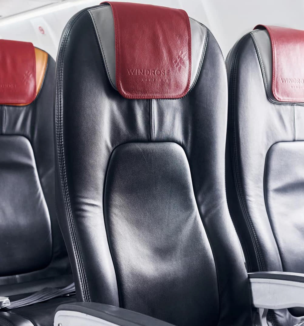
We created a logomark that represents airplane wings and tails emerging from a wind rose symbol.

Credits: Kaffeine Communications